How to Create Website Hero Images with Kre8or
Create a Stronger First Impression
The hero section is usually one of the first things visitors notice when they open a website.
It introduces the brand, communicates the main offer, and gives visitors a reason to continue exploring.
A well-designed hero image can make a website feel more professional. A poorly planned one can distract from the message or make important text difficult to read.
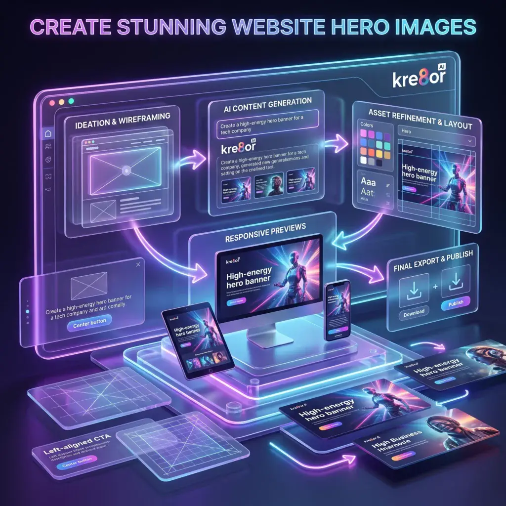
Kre8or can help you create original hero-image concepts for business websites, landing pages, portfolios, blogs, product launches, and online stores.
The key is to design the image around its purpose rather than generating attractive artwork and trying to force it into the page afterward.
If you are new to the platform, begin with my Kre8or AI Review for an overview of its creative workflow.
👉 Create Your Free Kre8or Account
Decide What the Hero Must Communicate
Before writing your prompt, identify the purpose of the page.
A homepage hero might introduce the entire business, while a landing-page hero may focus on one offer.
Common goals include:
- Explaining a service
- Introducing a product
- Promoting a free trial
- Announcing a sale
- Building trust
- Encouraging visitors to read more
Your visual should support that goal instead of competing with it.
Leave Space for the Headline
A common mistake is filling the entire image with important details.
Most hero sections also need space for:
- A headline
- Supporting text
- One or two buttons
- Trust indicators
Ask Kre8or to place the main subject on one side of the composition and leave clean negative space on the other.
For example:
A modern AI creative workspace positioned on the right side of the image, dark premium background, purple and blue accent lighting, clean negative space on the left for a website headline and call-to-action buttons, professional SaaS aesthetic, wide composition.
This gives you more flexibility when adding the image to your website.
Use a Wide Composition
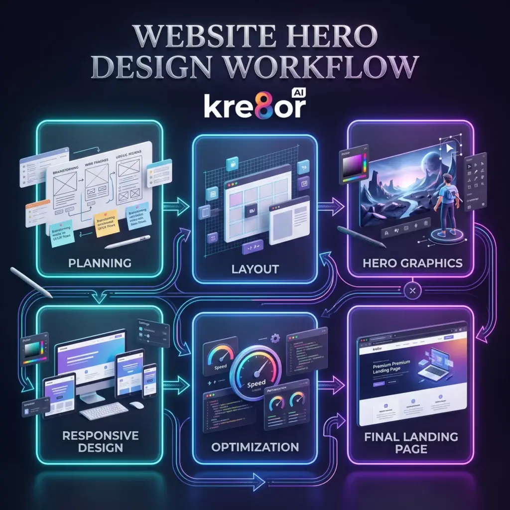
Website hero sections are usually wider than blog or social-media graphics.
Generate the image with a wide landscape layout whenever the available aspect-ratio options allow it.
Think about how the image will appear on:
- Desktop monitors
- Tablets
- Mobile phones
Avoid placing the most important subject too close to the edge because responsive layouts may crop part of the image on smaller screens.
Match the Image to Your Brand
The hero should feel like part of your website—not a random piece of artwork.
Reuse the same:
- Colors
- Lighting
- Mood
- Artistic style
- Level of detail
If your brand uses dark backgrounds with purple and blue accents, include that direction in every website prompt.
For a deeper branding workflow, read How to Build a Consistent Brand with Kre8or.
Keep the Main Idea Simple
Hero images often appear behind or beside important text.
Overly complex scenes can make the section feel cluttered.
Focus on one strong visual idea.
Instead of requesting:
A creative business office with ten screens, several products, charts, people, icons, text, lights, and multiple environments.
Try:
A premium creative workspace with one central AI design display, subtle floating graphic elements, clean composition, dark background, purple accent lighting, wide website-banner layout.
The simpler version gives the headline more visual space.
Choose the Right Level of Contrast
If white text will appear over the image, the background behind that text needs to be dark or visually quiet.
You can request:
- Dark negative space
- Soft background blur
- Subtle gradients
- Reduced detail behind the text area
- A gentle vignette
Always test the final section on both desktop and mobile before publishing it.
Generate Several Directions
Do not build your entire landing page around the first result.
Generate several concepts with different:
- Subject placement
- Camera angles
- Background styles
- Lighting
- Color intensity
Compare the images with your actual headline and buttons in place.
The best standalone image may not be the best website hero.
Refine the Strongest Concept
Once you find a promising image, improve it rather than restarting immediately.
You might need to:
- Simplify the background
- Move attention toward the product
- Create more negative space
- Adjust the lighting
- Strengthen the color palette
My Kre8or Workshops guide explains how refinement can fit into this process.
Example Hero Prompts
SaaS Website
Futuristic AI software workspace with elegant floating creative panels, dark charcoal background, purple and blue lighting, main visual positioned on the right, clean negative space on the left for headline and CTA, premium SaaS website hero, wide cinematic composition.
Online Store
Stylish product collection displayed in a premium modern studio, soft luxury lighting, products arranged on the right, clean neutral space on the left for promotional text, sophisticated eCommerce homepage banner, wide composition.
Freelancer Portfolio
Minimal creative desk with laptop, digital artwork, camera, and design tools, warm editorial lighting, subject positioned to the left, clean space on the right for portfolio introduction, modern professional website hero.
Common Hero-Image Mistakes
Avoid:
- Busy backgrounds behind text
- Important subjects near the crop area
- Multiple competing focal points
- Random colors that do not match the brand
- Text generated directly inside the artwork
- Choosing an image without testing the mobile version
A good hero image supports the page instead of becoming the entire page.
Continue Learning
- How to Write Better AI Image Prompts
- How to Build a Consistent Brand with Kre8or
- How to Use Kre8or Studio
- How Small Businesses Can Use Kre8or
- 25 Ways to Use Kre8or
Final Thoughts
A website hero image should do more than look impressive.
It should support the message, guide attention toward the headline, and fit naturally with the rest of the brand.
By planning the layout before generating the image, you can use Kre8or to create website graphics that are easier to edit, more responsive, and more effective.
Ready to Create Your Website Hero?
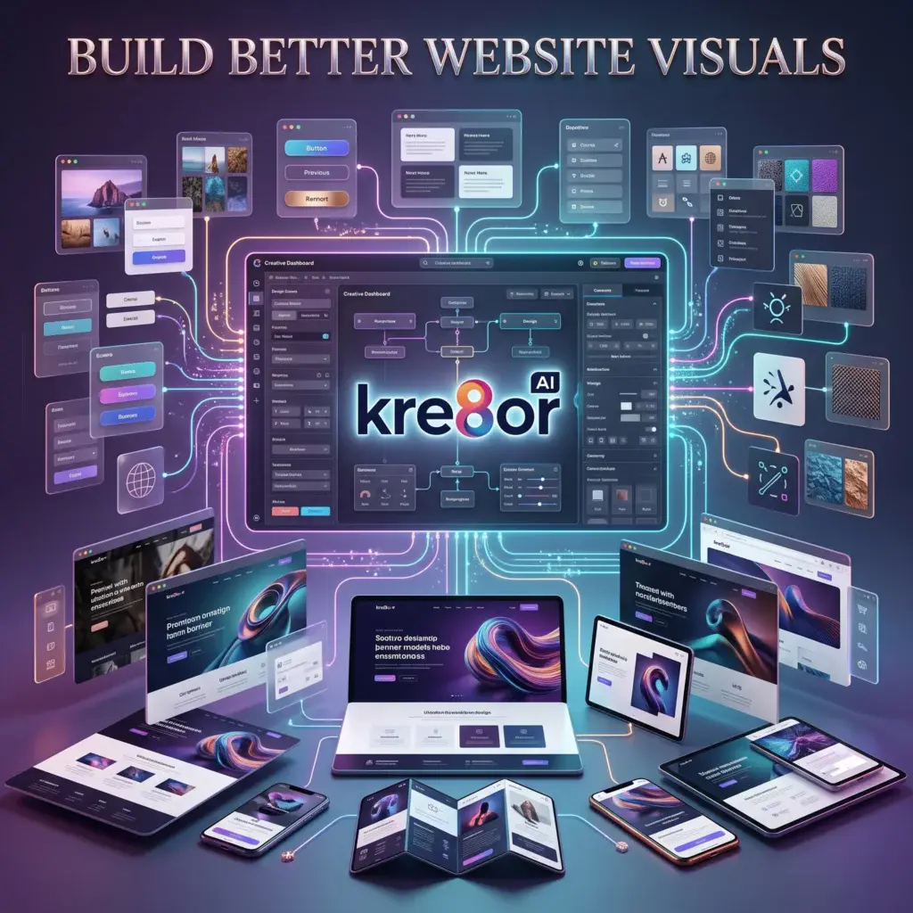
Use Kre8or to experiment with wide compositions, branded colors, and clean layouts for your next website or landing page.